 Two Fins Apparel - look good while supporting ocean-based charitiesA Perth-based label with the health of our oceans on their minds.

Meet Niqui Toldi, the illustrator behind BIGSOUND's massive branding shift
Plus, get a look at some of her incredible artwork before the four-day Brisbane conference kicks off in September.
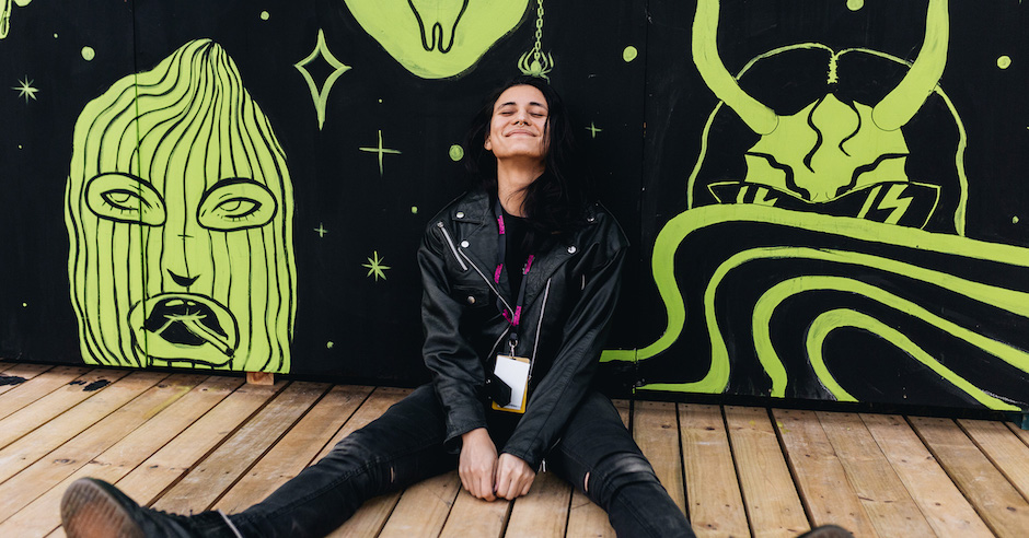
Header photo by Savannah van der Niet.
While the ever-expanding list of guest speakers and musicians may be the bigger drawcards to the annual BIGSOUND conference/festival, there's a lot going on behind the scenes of the four-day, Brisbane-held event. One of which is the festival's visual art aspect - from the art displayed as the festival takes over Brisbane, right through to what you see on its posters, websites and other images. Over the past three years, the festival has undergone a massive transformation, and behind it has been Brisbane design studio Bigfish and their lead illustrator Niqui Toldi, whose instantly-recognisable images now play a significant part in that iconic BIGSOUND look that has continually grown over the past few years to what it is today.
With BIGSOUND 2018 kicking off at Brisbane's Fortitude Valley on September 4 (running through to September 7), we caught up with Toldi to chat about the BIGSOUND transformation, her work and her relationship with music. Dive into it below, and grab those tickets and more information at BIGSOUND's WEBSITE before it's too late.
Hey Niqui – so to start out, how did you get into illustrating and what led you to working with BIGSOUND?
At 16 I pretty stubbornly decided I wanted to be a graphic designer and illustrator. When I was in year 11, I was also doing TAFE part-time. Then full-time. Then uni. During uni, I was freelancing doing poster designs for a group of clubs in Sydney. I cringe at the designs and drawings I did for them now but looking back it was a huge learning experience. A month after I graduated I got a job at Bigfish where I’ve been for the last 4.5 years.
I wasn’t actually pegged to work on BIGSOUND when the job came through the studio. Our designer Dave Byrne (who is amazing and the other creative responsible for this year and last year’s BIGSOUND campaign) came up with all these different designs based on colour and photography but nothing was feeling right to him. He asked if I could create some characters, gave me a colour palette, and showed me a picture he liked and an hour later I shot him back a bunch of drawings. We worked out pretty quickly that we were a collaboration dream team, and while working on BIGSOUND, we’re constantly going back and forth with each other.
You’re one of the people behind the art of BIGSOUND and played a big part in their rebrand. How do you even begin to tackle such a big project with so many illustrations?
On the second night of BIGSOUND while everyone was in full festival-mode Joel Edmondson (BIGSOUND Executive Producer) excitedly emailed me with an idea for where we could take the 2018 look before it escaped him, so when Dave and I got to work we already had a bunch of ideas ruminating.
We knew that they were really happy with the 2017 illustrations and wanted to keep the same feeling. It’s always challenging trying to one-up something that people like and the initial illustrations that I did for the new campaign actually got rejected by the BIGSOUND team.
What’s the kind of processes and planning that has to go behind something like this?
We started developing the look of this year’s BIGSOUND around about December last year.
As much as the look of BIGSOUND has been a collaboration between myself and Dave, it’s also a collaboration with the client, QMusic and BIGSOUND, and their vision for the festival. I could draw a bunch of cool shit and slap it on a poster but if it doesn’t connect with the audience and the client, then it’s a failure on my part.
There tends to be a bit of back-and-forth between Bigfish and BIGSOUND. Sharing sketches, rough layouts, colours — that kinda thing. We try to make sure everyone’s happy before we move onto the next step.

BIGSOUND 2018 Art.
What sort of inspiration do you draw from when it comes to these illustrations?
The previous agency had done this huge UFO-Eyeball motif for the 2016 BIGSOUND Festival brand, so when we took it on in 2017 I wanted to have a little nod to the previous year’s creative so it didn’t feel totally disconnected. Eyeballs really became a thing for BIGSOUND — if you think about it, the whole festival is about being seen and discovering something new so it felt like a good fit.
The idolisation of musicians is an interesting concept to me. In this year’s campaign, I created two humanoid characters that I sort of see as these BIGSOUND oracles. They’re like these all-seeing, all-knowing, super-human entities that hold the prophecy of the future of music in their hands (haha).
How do you capture the essence of something like BIGSOUND when you’re creating illustrations for it, or do you think that’s not particularly important in jobs like these?
Joel (BIGSOUND Executive Producer) really wanted us to create a look that was unlike any other festival. For the team at BIGSOUND, the event is all about newness, pushing what we expect an industry-led festival to be, and creating spaces that help shape the future of the music industry. So we really pushed the futuristic aesthetic and tried to make it weird and wonderful.
Aside from BIGSOUND, what have been some of your big achievements over the last few years, and can we check ‘em out anywhere?
I just did a big-arse mural in the artist area at Splendour In The Grass which was awesome to work on! This year I also got to do the hero illustration for Brisbane Writers Festival – that’s been another nice Bigfish job.
Thinking back though, one of the projects I still feel proud of is the titles I designed and art directed for The Design Conference back in 2015. I had only been at Bigfish a year (if that), and it was the first time I was left in complete creative control of a project. I worked mostly with Sem Han who is an amazing animator that also does most of the BIGSOUND animations. Because I was leading the creative, the whole experience fostered this sense of shared trust in my team. It also forced me to trust myself, which was weird for me. There are probably a bunch of design decisions I’d change now, but I still feel fond of it.
Recently I’ve been organising a risograph exhibition for September 8 & 14 in Brisbane and Melbourne respectively. The Exhibition is called ‘Dead Format II’ so keep an eye out for that one!
I’m lucky to work in a studio that is cool with (and encouraging about) me having a side-hustle. Having creative autonomy is super important to me because it feels like such a giant part of my personality.
For more Bigfish related work, you can visit our website.
For more of my personal work, you can follow me on Instagram.

BIGSOUND 2017 Art.
At the end of the day we are a music site, so what is your relationship with music like? Do you listen to music while you create? Does music influence any of your art?
Music feels like a big part of my life, but I don’t consider myself to be very musical. Most of my friends are musicians and I go to shows fairly regularly, so I feel part of that community. I also only date musicians (just kidding!). I see music as a way of connecting and engaging with the world – in a similar way illustration does that for me too.
I enjoy listening to music when I’m creating and it definitely serves me in my practice— Sometimes I connect with a lyric, and it’ll give me an idea for a drawing. Sometimes I use music to maintain a mood while I’m drawing. Sometimes it’s just nice to listen to something and not get distracted by everything else.
Lately, I’ve been revisiting a bunch of old Oneohtrix Point never albums. I’ve also got a bit of a design crush on David Rudnick who’s been doing the artwork for the Age Of release.
Have you checked out any of the acts from the BIGSOUND line-up? Who are you listening to and keen to see?
Yes! I’ve been listening to ARSE, so I’m keen to see them. Also Pool Shop, Genesis Owusu, KAIIT, The Merindas, James Wright Trio, TAPE/OFF and I’m sure there are a bunch of other gems in the line-up too! I’m looking forward to it.

BIGSOUND Visual Art Display.
Follow BIGSOUND: FACEBOOK


 Two Fins Apparel - look good while supporting ocean-based charitiesA Perth-based label with the health of our oceans on their minds.
 Meet Beamhacker, The Local Artist Creating Magic with Tens of Thousands of LightsWe get to know the LED wizard who was recently announced as part of Vivid Sydney 2023