
 Swick & Douster - Internet DreamsGreat concept, epic tunes.

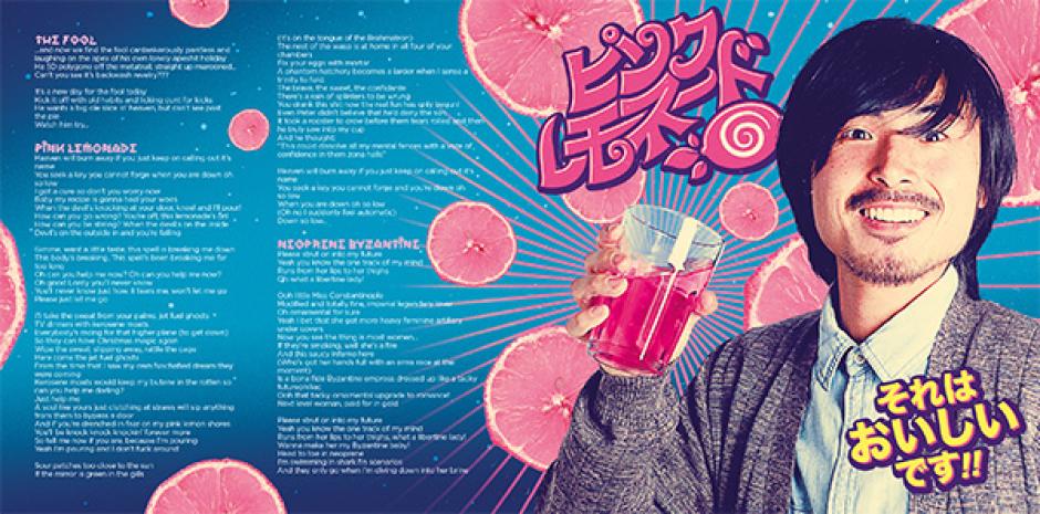
The Art & Music Of Pink Lemonade
Celebrating their new album, Closure In Moscow interview the artist responsible for the LP's incredible design.
10 years ago
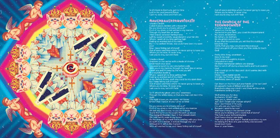
Melbourne progressiver rockers Closure In Moscow have just released their second LP, Pink Lemonade, which has been receiving glowing reviews from all the corners of the world. And we decided that rather than us tell you to go buy it (you should), we'd do something a little different, and focus on the incredible art and design of Pink Lemonade's cover and booklet layout. It was done by French artist Stéphane Casier, and Christopher De Cinque from Closure In Moscow had a chat with Stéphane, looking at his influences and the art culture of Paris, while Stephane quizzed Christopher on the group's latest album, their inspirations visually (and sonically) and more.
THE ART & MUSIC OF PINK LEMONADE
CHRISTOPHER DE CINQUE x STÉPHANE CASIER
Christopher De Cinque: Hey Stef, firstly, thank you for taking the time to do this. The first time I ever saw your work, it was the brilliant Kaiju poster you did for Closure's first show in Paris. What is it that you appreciate about Japanese aesthetic values and how much has this influenced your work? Who are your favorite Japanese artists?

Stéphane Casier: Hi Chris, my pleasure! Back when I was a kid there were lots of Japanese anime and series on French TV because it was way cheaper to buy foreign shows and just translate them than make new ones. So I grew up watching shows like Dragon Ball, City Hunter or Bioman and spent all my childhood trying to draw my favorite characters. Giving me a paper sheet and a pencil was the easiest way for my parents to keep me busy and quiet so everybody was happy haha. At this young age, I believed Japan was some kind of magical land where people drive giant robots, bad guys have big dragons tattooed all over their body and trees are pink (I had never seen a Cherry Tree where I grew up) and my biggest dream was to go there and become a mangaka (manga artist). Well, it never happened but it was pretty obvious I’ll end up as an illustrator or something, wherever I’d live.
I was and still am a huge fan of Akira Toriyama’s work and I even dedicated him my right arm by getting a sleeve tattoo showing some characters from his Dr. Slump series two years ago. He was my main influence as an aspiring artist and my life wouldn’t have taken the same path without him. But of course Japanese art culture is more than just manga. I could spend hours watching woodblock prints from the 18th and 19th centuries. The line work is amazing because, even if there are lots of tiny details in the characters’ clothes or in the backgrounds, the overall illustration has a strong "straight to the point" feel to it and you know each line is there for a reason. This heritage is still shown in most of the designs you can see in Japan.
But coming back to that first poster I designed for you, when my girlfriend told me about this show she was organizing, I had never heard about Closure In Moscow before. Then, I went online to hear and see some stuff and it was love at first sight! I saw you and Manny wearing some Batman, Superman and Totoro t-shirts in music videos so I thought "those guys love super heroes and Japanese anime, let’s do something with that!" I always wondered if that poster had an influence on you to make the ピンク レモネード song. Did it?
CDC: Yes it did. It was the first time I'd seen something overtly Japanese visually coupled with the band’s identity... I thought it worked perfectly and it makes me wonder why we aren't called Closure In Kyoto instead. I thought this could extend into the music too and like you I've always been a huge fan of Japanese artists and culture, so I wanted to dabble in the aural side of this aesthetic. We were lucky enough to collaborate with the chiptune band YMCK on that song which was an absolute dream come true. I'm pretty amazed that you picked up on what we were into just by seeing a couple of t-shirts we had worn and ran with something that totally spoke to us. I didn't know this! I thought it was just coincidental, it's awesome you went to that trouble.
Could you tell us about your design philosophies? In our time working together I've noticed you have quite a different approach compared to artists here in Australia, do you think perhaps this is partly due to the rich heritage France has in the visual arts...

SC: What is so different in Australia? Did you ever have a bad experience with artists there?
CDC: Not necessarily bad experiences, we've just never worked with anyone that approaches things with historical and cultural precedents in mind as much as you, it feels a little more homogenized, and any cowboy with Photoshop can slap something together without much depth beyond the surface layer. I'm sure they are out there, I just got the feeling that because there is a much richer arts culture with a longer history in your part of the world, this would be ingrained in your methodology... Paying respect to the masters while forging a new path forward.
I know you do some corporate work, what are your thoughts on balancing creativity with marketable branding? I think the art you have done for Pink Lemonade, has a very clear "brand identity" for lack of a better term. What is your approach in this regard?

SC: I started my career as a freelance graphic designer in 2005 in an advertising agency and it really taught me a lot, but I also immediately knew it wasn’t something for me. Corporate work is the kind of work that makes sweat drops run over my forehead as soon as I read the brief because there is 90% chance I can’t design what I think is the best and someone’s gonna try to teach me my work. I’m always asked to put a big fat ugly logo somewhere it clearly doesn’t fit or change the layout because, you know, "I’m the client, that’s my money, you do what I want". It’s very hard to be creative when the only thing the client wants is making everything bigger on the poster because he thinks that’s the only way to make his product or brand pop up. Fortunately, some clients are more open-minded, they trust you, and the result is creative and marketable.

I’m very lucky to be a graphic artist because people give me money to draw some stuff, I mean, what could be cooler than that? But it’s always balancing between what clients want and what you think makes a good design and it’s really frustrating some times because you create something with your own taste and style and you know it’s gonna be judged and approved or rejected. And I think that’s the same in music, isn’t it?
CDC: For sure, we wrote an album that we would want to hear as opposed to second guessing what our "target demographic" would want to hear in the hopes that we would be creating something fresh and fun, exploring our own creativity... Some people still have the nerve to call it self-indulgent, which boggles my mind... I think that's the whole point of creating art, you indulge your own creative urges and trawl the depths of your imagination to haul back some beautiful mutant sea-beast for others to behold... But for some reason a certain sect of people have this entitled idea that you owe it to them to present everything in a neat, three minute, standardised package because that's what they are conditioned to want to hear because of the over-commercialization and "McDonaldsfication" of music.
I think music should sometimes make you feel uncomfortable, not always be pleasant and danceable... I look at it as creating a living, moving, breathing sculpture where the purpose doesn't always have to be reeling people in with instant aural gratification. That's fine of course as well, I like it to be challenging also, and like you said it's hard to strike a balance when you have everyone around you on the business side of things trying to tell you how to shape it according to profitability.

I've mentioned in the album liner notes that you are the honourary sixth member of the band because I feel that what you have created not only compliments the music on the album, but has become a crucial part of the album's overall identity. What inspirations did you draw from when putting together the visual component of Pink Lemonade? Tell us a little about your process, did it differ at all from other projects?
SC: I was very flattered when I read the credits because that’s the best compliment you can make to a graphic artist, so thank you very much! I think everything from the start was made to make something good on this project, because we have a mutual respect for each other as artists, you came up with really good ideas and you gave me your complete trust to make them real. Plus, the overall idea of this design was making something fun to work on and to look at.

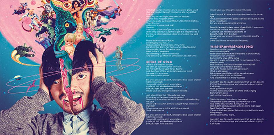
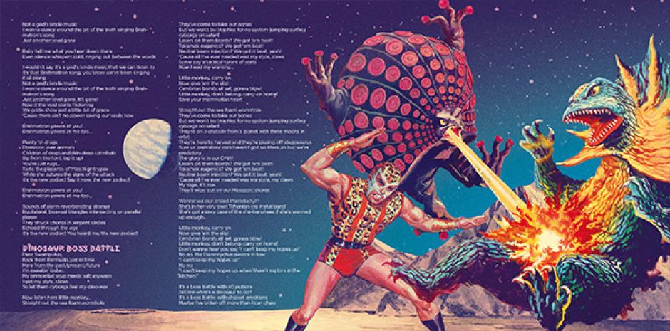
But it was really different from my other projects indeed. First reason is I don’t often mix photos and illustrations. But you and I wanted to bring this artwork somewhere between reality and fantasy so making a collage was a good deal. You and Ben Clement shot photos of the human characters appearing in the artwork and then I had to search for a lot of different pictures that I could all make live together with those photos and build this crazy universe that is Pink Lemonade. And I think it worked out pretty well.
Second reason is I’ve been working on this design from time to time, during one full year because you guys still were in the studio, finishing the songs, and touring at the same time. So, some parts of the design have been done at the very beginning, following your first ideas, and then, when you were able to send me some tracks and lyrics I tried to bring them to a "visual life". You came up with the seeds and I just watered them so what was YOUR inspirations for the overall visual concept?

CDC: The most apparent one from the front cover is Jodorowsky's film The Holy Mountain, but I wanted to present the ideas it in a kitschy, almost ‘60s sci-fi kinda way. So you have the alchemist on the front that appears quite foreboding, but there are hints of the kitschy silliness with the logo and the pink lemonade cocktail, and details on the table like the jar of lolly snakes that you might not pick up on at first glance... Another thing that I love the aesthetic of for some strange reason is Japanese soft drink print ads. When we toured there I was always drawn to them and felt it reflected the idea of selling this sugary pink cure-all as a sexy must have thing, but there is still that slightly corny, kitsch aspect, like they are trying to make it slick and Americanised but it's still a little too cutesy-happy-rainbow.
As far as the overall concept, I thought it was very important to create a peek into a universe that uses a lot of allusion to give a living depth to things, so you can look at it and get a sense that you are getting a snapshot of this somewhat sinister, multidimensional Alice in Wonderland meets the Wizard Of Oz world, thrown in a retro-futuristic blender and spat out through the ‘60s matrix, the version that was headed by the director of The Creature From The Black Lagoon, instead of the Wachowskis.
Speaking of the Matrix, in the age of computer-based graphic design, you are an incredibly adept hand illustrator/typographer that still relies largely on this skill. Do you think it is a dying art in the graphic design world?

SC: Well, it was dying for a long time but it’s clearly coming back to life. It’s very easy to find online a cracked version of Photoshop and call yourself a designer but it’s way harder to make your own types by hand or sketch a layout directly on a paper sheet. I’m a big fan of vintage designs from the 19th century to the 1960s so I’ve always tried to make as many things by hand as possible and I’m very happy to see more and more designers starting to do so. Maybe people got tired of all those computer based designs and wanted to go back to the real stuff, I don’t know. But once again it’s the same with your music. You play some kind of progressive rock with a ‘70s feel though it’s not the actual trend.
CDC: Lastly to follow on from that last question, a little hypothetical scenario. Starting tomorrow you can only use either paints and pens, or a computer to create art. Which do you choose? Why?
SC: It’s not a surprise if I chose paints and pens, haha. This way maybe I’ll stop being distracted during my work time by internet stuff and emails! And I guess I’d have to come to Australia to talk with you about your next album’s artwork over a drink… Well, that’s a good thing.

Head to the Closure In Moscow WEBSITE for more audio/visual joy, likewise Stéphane's website, YEAAAH-STUDIO.COM
 Swick & Douster - Internet DreamsGreat concept, epic tunes.
 Death Grips drop new LP feat. Bjork Out of nowhere Death Grips drop new LP featuring Bjork on every track.